Knowing you can make a big difference and change your whole mood from how your space looks has always fascinated me. I have always loved arts and crafts and grew up with a very talented mother who inspired me to take an interest in anything creative. I went on to complete a degree in interior design, as well as working with brands like Laura Ashley before joining Jim Lawrence.
, we find our customers are looking for high-quality products, timeless designs that are made to last. Also, I know from experience that when purchasing a product, it’s frustrating to try and get hold of someone to ask questions. Here, the team enjoys giving a personalised customer service experience.
It’s a pleasure having a cup of coffee with our customers in our showrooms, discussing their exciting projects, looking at pictures of their renovations and chatting all things interiors.
have a relaxed atmosphere for customers to take their time and choose their home decor at their leisure, but we’re always here to offer a helping hand when needed. Dogs are welcome too, which is not only convenient for customers but a treat for us!
Let’s talk colour! When it comes to room design, many people have a paint colour in mind before they get started which naturally sets the tone for the whole space. Where should people begin when looking to find a colour that suits their room?It is good to start off knowing the paint colour you have on your walls and what other fabrics you already have in the room as this will dictate the accessories and window furniture and how bold you can go. I always recommend making a
mood board with a few of the colours you already have to see what
colours and patterns work well with them. If the room is very much a blank canvas this is a great opportunity to have some fun with colour and create a space that suits your personality.

We can talk about seasonal trends, but in reality, not everyone has the capability to switch their whole scheme up every few months. How can a room be made to feel like new without a full redesign?Yes, very much so. This is often a simple and cost-effective solution to give a room a seasonal refresh. You don’t have to do it to every room in your home but choose one or two where you spend the most time. Choosing light and pastel colours give a summery vibe while switching to richer, deeper tones of
ochres and warm browns will cosy up your scheme for the colder months.
In your experience, are some colours more effective than others at livening up the house and making it feel more like home? Would you advise differently, depending on the home itself?Not every trend will work for every house style/period, but picking a key colour that goes with everything is the place to start.
Neutrals suit any style of home and can be complemented with splashes of colour to suit your home’s style. Our
Isabelle Linen in Natural can give an instant uplift in mood. Alternatively, pick a colour that makes you smile as you do have to live with it day in day out – so why not!
Have you got any colour combo faux pas that you strictly avoid?Generally, I avoid any colours that clash and do not mesh well with each other because it is visually jarring. However, often it is just a matter of choosing the right tone. Bright oranges and bright greens don’t look good together but it you change it a
burnt orange and
dark green then I’m all for it.
Patterns like chintz florals, gingham check and stripes continue to erupt from the pages of interiors magazines – a place where many of us turn to for inspiration. Do you have any tips for those who want to tentatively approach this bolder style?Mixing patterns is not for the faint-hearted and can scare most people but done well will really create drama and personality in a room. For those not brave, pick a patterned, a stripe and a plain fabric within the same family of colour. These can then be distributed sensitively around the room perhaps with a patterned wallpaper and plain lampshades, plain curtains and a striped blind with a mix of cushions. Don’t be afraid to mix metal finishes either.
Other than choosing the right tones and texture, what’s a sure way to dial up the cosiness at home as winter draws in?Keeping the heat in is a must, especially with rising energy costs.
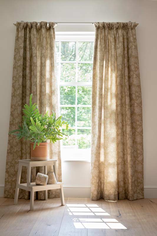
Curtains are brilliant at insulating a room from draughts. Make sure they don’t cover your radiators and if they are made of thin fabric or you are considering investing in new ones, it is well worth getting them interlined. Not only does this help keep the warmth in, but it also gives extra body to your curtains helping protect them from fading in the summer months and they are a great noise reducer.
Curtains can also be used to help keep draughty doors at bay. We make
portiere rods that are designed to enable curtains to be fitted to the back of the door without getting in the way of the door opening and closing. The curtain can be drawn over the edges of your door and any letter boxes to keep the cold out. Choosing a thick fabric such as a
tweed (wool is a great insulator) or velvet will help lock the warmth in.

If we want to fully enjoy the colour in our room, it needs to be properly lit. What’s the best way to maximise your lighting in terms of efficiency and style during the winter?If you have a dark room, artwork can really lift the space. Illuminating this art with a
picture light is a great way to give your lighting scheme a purpose other than lighting up a blank wall. Choose
lampshades in linen or
cotton for the best lighting as these will allow light to escape through the fabric as well as from the top and bottom. Darker colours or thicker fabrics like tweed and velvet create more focused pools of light that is great for mood lighting.
If you don’t have wall lights, table and floor lamps can bring light to a space for a cosy, ambient feel on a cold evening. Choose
light bulbs that dim also helps to create different moods in a room – bringing energy for a family board game but dimmed down for a movie night.
Speaking of lighting, are there any particular colours to look for that best complement metal finishes?I think dusky pinks go beautifully with greys like our Polished finish, while almost anything will go with Matt Black. I particularly like our
Isabelle Linen in Black and our new
Waterford Linen in Sage with our
Matt Black and
Beeswax finishes. Likewise,
Antiqued Brass is such a versatile finish almost anything goes well with it. I like to contrast the coolness of our
Hunstanton velvets in Navy or Teal with the warmth of brass. My all time favourite fabric is
Isabelle Linen in Natural as it goes with everything and looks great when the lights are on or off.
Finally, a few quickfire questions…
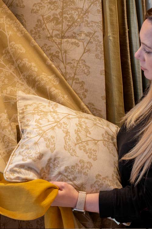
What’s your favourite Jim Lawrence fabric collection to date?I’m really excited about the new additions to the
Cow Parsley Collection as we have launched a reverse version of the fabrics so that the etched cow parsley motif is in colour on a natural background. I love the new
Indigo, a deep dusky blue that is bound to be a firm favourite.
Your favourite place to gather interior inspiration?Nothing produces better colour combinations than mother nature, from our beautiful natural landscapes to our vibrant birds.
If you had to paint your home in one colour, what would you choose?I love navy blue as there are so many colour combinations to pick from to go with it – yellows, pinks, oranges and greens to a simple, crisp white. Tikkurila is a brand of paint from Finland that I have used a lot for great coverage.
What is your hero product that we make? Something a customer might not know they need…My top tip is to use our
Flush Mount Ceiling Rose as you can completely change the look and feel of a room depending on the shade you pair it with. I also recommend our
Fordham Ceiling Roses as a quick easy fix to make a room look a lot nicer. Replacing standard white plastic ceiling roses with a lovely metal one transforms a room for very little cost.
What’s the best part about working with Jim Lawrence?Knowing that our products are made right here in Suffolk and seeing them being crafted from start to finish by such talented people. You can be confident of the quality when you see the care and attention that goes into making them.

We would love to see how you translate these ideas into your own home this season, so don’t forget to tag us on Instagram or Facebook. For a wealth of home décor and interior inspiration, view our Pinterest page.

Follow us